Rise and Shine App
A specialized mobile app to order coffee delivery, pickup, or even order from your in-house table
-
The Problem:
Users who needed to make quick orders or large orders were frustrated by the wait in line and wanted a way to order and skip the wait.
-
The Goal:
To create an app that was easy to navigate and offered ways to order coffee and food for multiple circumstances, including for pickup, delivery, or even additional orders to be brought to your table.
-
My Role:
For this project, the client wanted a UX/UI designer for an app, but also wanted an entire branding update. I ideated different options, created paper and digital wireframes, and then worked on a logo and branding update to make a cohesive style for all future endeavors. I then conducted usability studies, and created digital high fidelity prototypes. I used Figma for the lofi prototype and Adobe XD for the Hifi Prototype.
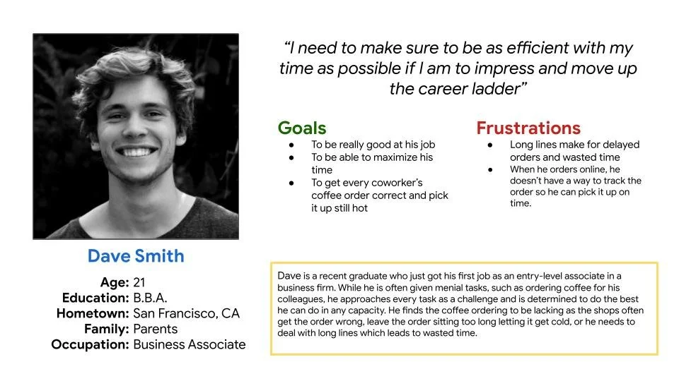
User Persona
Users were frustrated that they needed to wait in line to order something new when they already have a table.
Pain Points
Users who had large orders or needed to order quickly still needed to wait in line to order, and then wait for the order to be made.
Users wanted to be able to track their order so they didn’t come to pick it up before it was ready.
Paper and Digital Wireframes
Brand ReDesign
I started the brand redesign with the logo, exploring font pairings and typography. I moved on to explore logos, first in outlines, then in black and white. When I got a color palette approved from the client, and narrowed down the icons, I made more variations in colors. I worked on these in Adobe Illustrator.
Mockups and Usability findings
The Lust Script ended up being too difficult to read so I switched it to Abril Fatface. Some users liked the cart button but wanted an easier way to navigate home. Not all users realized that clicking the logo would take them home too, so I added a floating home button that would give another option.
Accessibility Considerations
-
Users wanted multiple ways to access the homepage so I added an easy home button in the corner that would allow users to go home when they don’t know that the logo navigates home as well.
-
I changed the font to make sure it was more readable. Abril Fatface provided the same bold look while being more readable for the headers
-
Lastly I made sure to double check the contrast to make sure all fonts, icons, and backgrounds passed WCAG contrast standards.


