


Venue Finder App
A specialized mobile app to compare wedding venues.
-
The Problem:
Users were frustrated by the lack of information, accessibility, and photography on wedding venue apps.
-
The Goal:
To create an app that was easy to navigate, provided enough easily accessible information, and made users feel like their venue shopping needs were considered.
-
My Role:
I was involved with the project as UX/UI designer. I ideated different options, created paper and digital wireframes, conducted usability studies, and created digital high fidelity prototypes. I used Figma for the entirety of this project.

User Persona
Users were frustrated that venues don’t often provide enough information on their website.
Pain Points
Users found it frustrating that the venues often didn’t have any sort of method of showing when they were available vs when they were booked.
Users wanted to know how accessible the venue was, with specific information about what amenities were provided.
Users wanted more photography to show the venue in both an empty capacity and a full capacity and with a variety of decorative options.


Paper and Digital Wireframes

Mockups and Usability findings
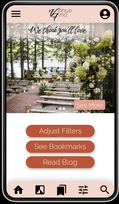
A navigation bar was added to the bottom. This created additional links directly to the pages that users were having trouble finding before. This also made the screen feel cleaner and more organized. I decided to keep the buttons in case some users preferred to read text than use icons.
The contact button was big and bulky, so I decided to reduce it down to an icon. It made viewing the page much easier while always being an option for the user to hit whenever they wanted.
Accessibility Considerations
-
The first accessibility option I considered was using both icons and text. This could appeal to multiple users and be quick and easy information to view.
-
I also added multiple modes of navigation. I used an icon based navigation bar at the bottom of the page but also used text based buttons on the homepage for multiple options.
-
Lastly I made sure to double check the contrast to make sure there was a contrast of at least 5:1 for all elements.
